

Project Overview
Houghton Mifflin Harcourt (HMH). K0-K12 Educational Platform
Houghton Mifflin Harcourt (HMH) is a global learning company, in 1832, HMH specializes in educational content, services and cutting edge technology solutions.
HMH creates experiences for students, teachers, parents and lifelong learners, available through multiple media.
The Company provides print and electronic textbook curriculum, learning content, assessment tools, and services.
Digital footprint: 50+ million students
Methodology: Agile (Scrum)
My Role
I led the UX and Interaction Design (IxD) efforts for the HMHONE Core Team, applying skills in user research, wireframing, prototyping, and design systems. This team was responsible for establishing the foundation of the entire application—hence the name "Core." We defined all architectural, structural, visual, and functional guidelines, ensuring design consistency and scalability across platforms.
The HMHONE project was globally distributed, with cross-functional collaboration across teams in New York, Boston, Orlando, Dublin, Prague, Warsaw, and Mumbai, requiring strong communication, leadership, and agile design practices.
I was the only UX designer in Core team. Overall we had 7 designers who were responsible for different areas of the application, from assessments and assignments to reports and school management. It was a diverse and talented group of people. We worked closely together to create something extra-ordinary: a smart, robust school management system which would simplify every day life for millions of teachers, students and school management across the United States of America.
The project was running for about 8 months before I joined in. A lot of great work was put in place, the main foundation and directional goals have been set, the structure of the application has been already developed. It was pretty challenging for me to get up to speed with 8 months of meetings and agreements between management, designers and developers. However, after about 30 days I was flying through tasks and leading UX work of the Core team.
I am especially proud of bringing the importance of end-user needs and goals back to the picture, developing true personas and facilitating user testing sessions. Out of 7 designers we had in our team, 5 were junior UX designers. My focus was to guide them and encourage the empathy for the end-user of our application. In fact, I started referring to students, teachers and school management as that, not as end-users. It helped all of us to stay in focus and solve real problems for real people by being true designers and creating beautiful and meaningful features. As they say "art is self-expression, design is problem solving".
My greatest achievement in this role was a successful completion of Alfa-release version of the software. It received glowing reviews from the Board of Directors and stakeholders.
Skills:
UX Research, UX/UI Design, Human-Centered Design, Prototyping & Usability Testing, Agile Delivery, Stakeholder Collaboration
Value for the client

EMPATHIZE
Understand The Challenge
Problem Definition:
Users faced a fragmented experience due to multiple login areas, inconsistent interfaces, and outdated functionality across several legacy applications.
Overview:
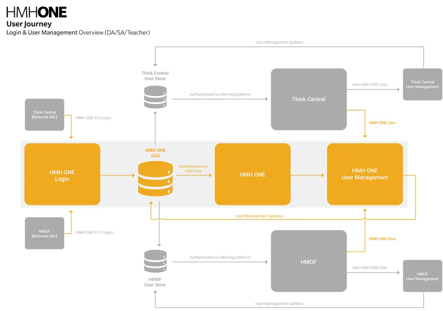
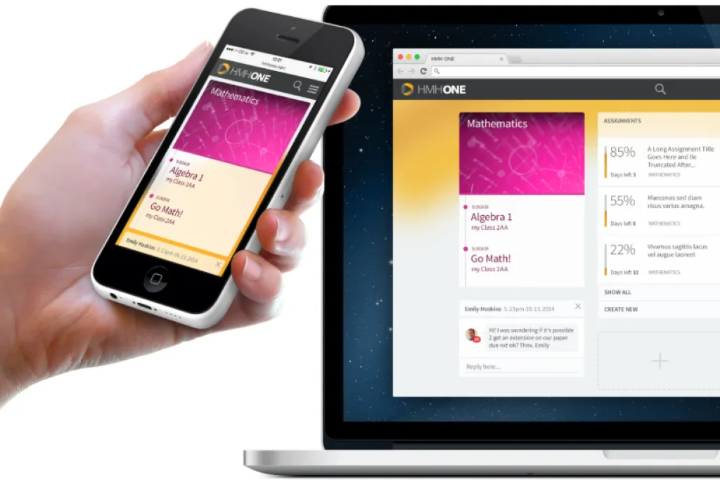
HMHOne was designed to combine and replace several existing applications. The biggest challenges included managing multiple login areas and resolving inconsistencies in user interfaces.
Each portal had different URLs, login credentials, and visual styles, which led to confusion and inefficiency.
Additionally, the legacy systems lacked many modern features expected in today’s marketplace, making a unified, user-centric solution a must.

DEFINE
Define Solutions
Research
We conducted extensive research and analysis sessions, drawing insights from user surveys, staff interviews, usage analytics, market feedback, and online message boards.
By evaluating existing applications on the market and their functional gaps, we gathered the critical information needed to begin designing effective solutions to the identified challenges.
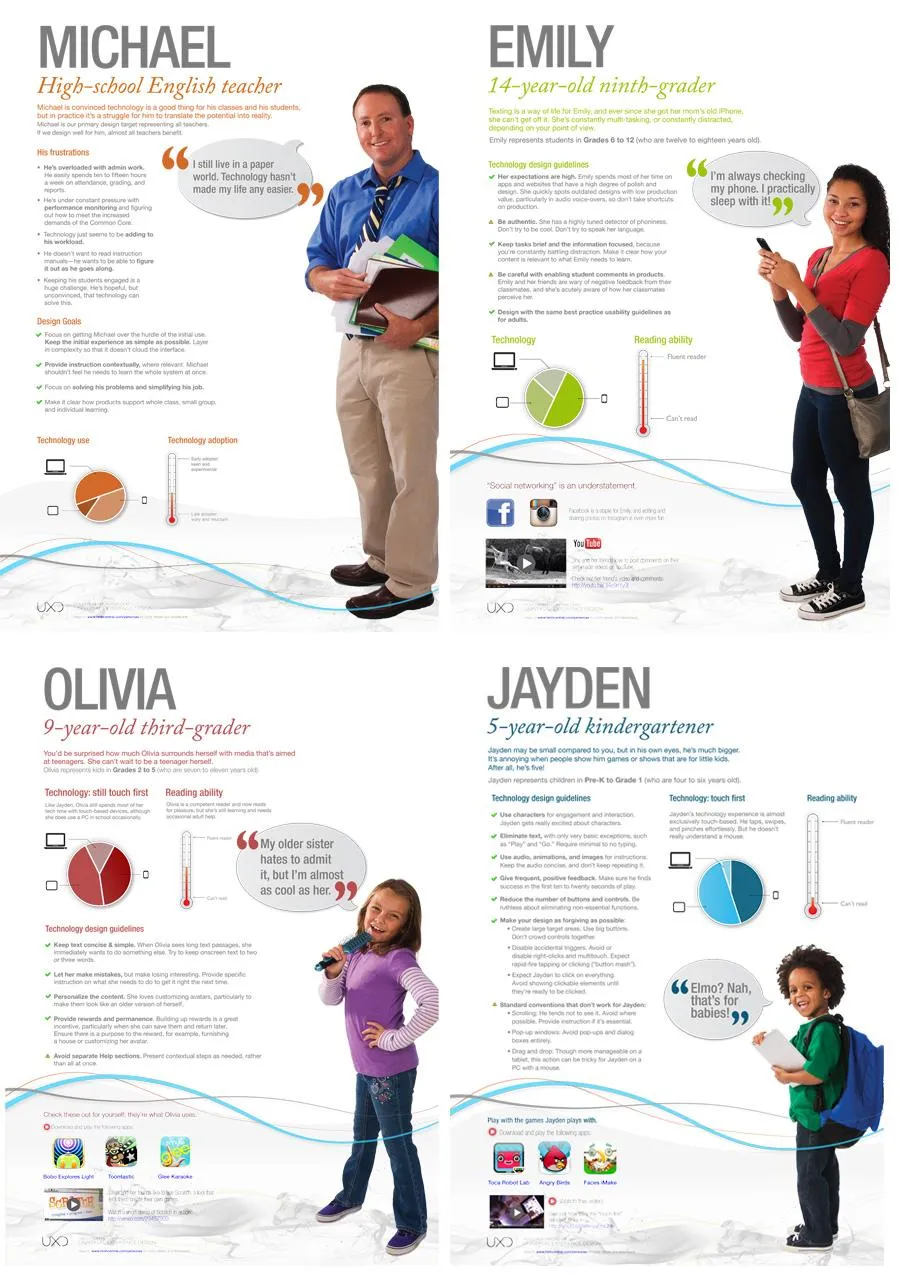
Persona & User Scenarios
Based on the user personas we developed, we organized information into logical sets aligned with different types of user access. This approach allowed us to filter and display only the most relevant content for each user type, significantly decluttering dashboards and making space for high-priority information.

IDEATE
Explore Options
Additionally, each user was assigned a tier level aligned with the K0–K12 school system, ranging from Tier 0 to Tier 12, along with separate tiers for teachers and administrative staff, each with access to different levels of functionality.
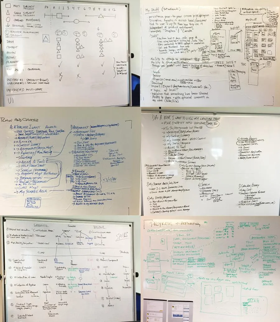
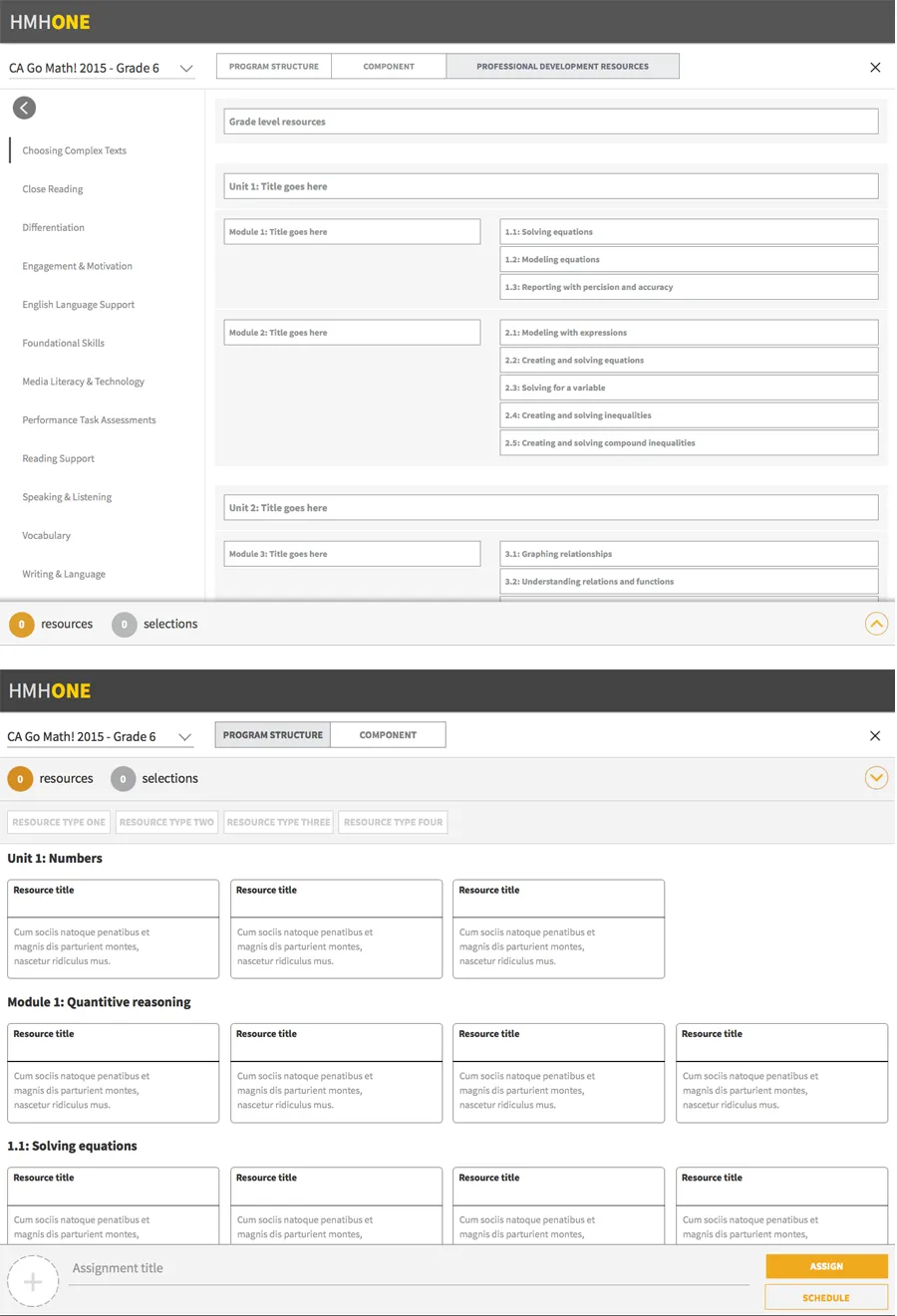
To communicate how these roles and features would work together, I created a series of wireframes presented to the Board of Directors and development team.

PROTOTYPE
Consolidate Exploration
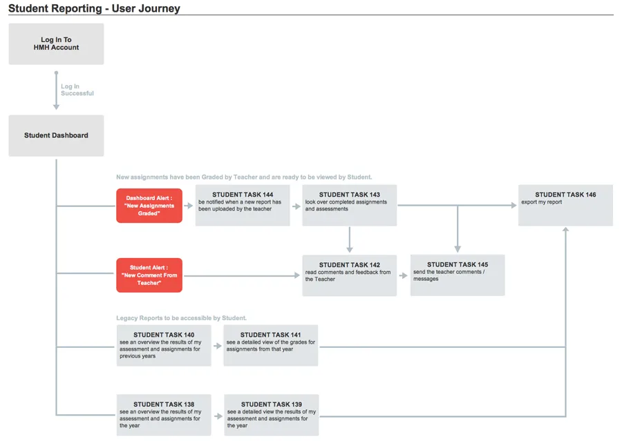
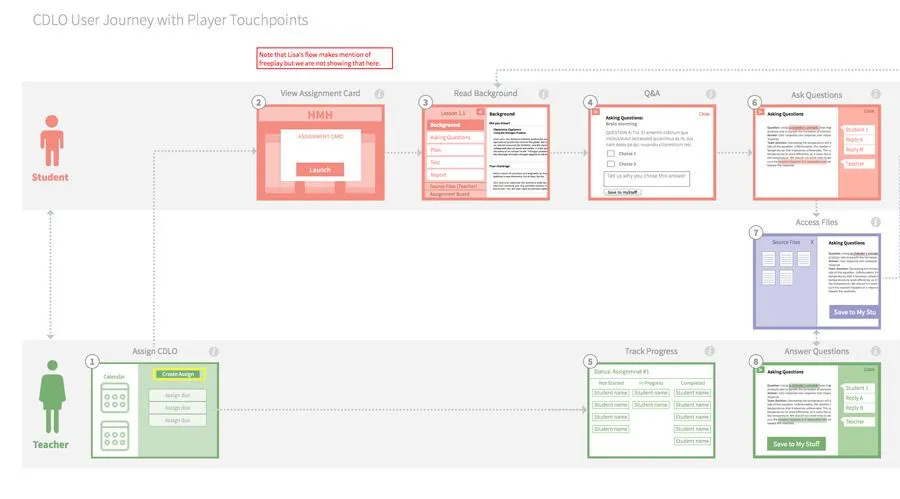
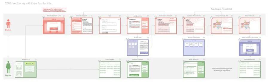
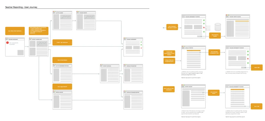
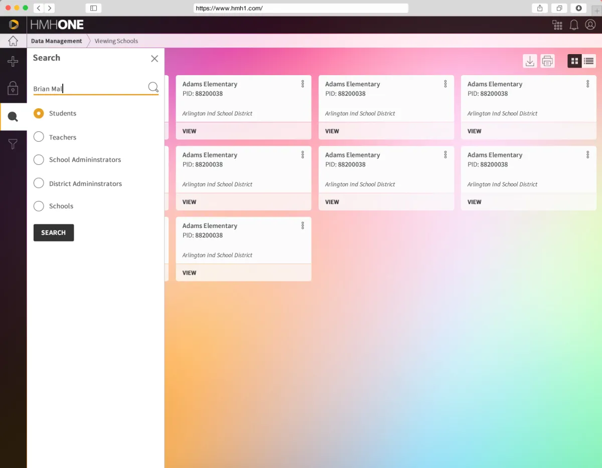
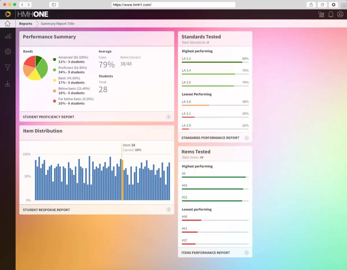
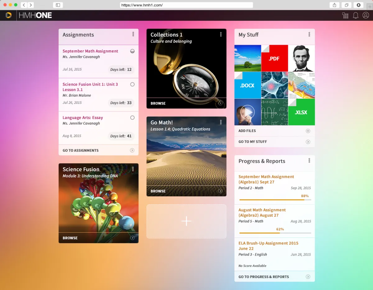
User journey and Wireframes
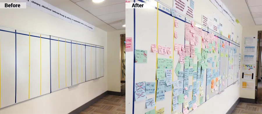
Because of the size and the range of locations of our teams, we had to create wireframes and prototypes for each aspect of new functionality. It was much easier to explain the flow and micro-interactions when a working prototype is in place.
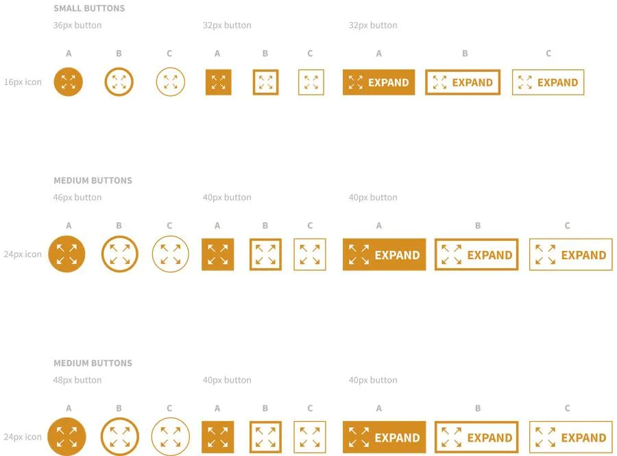
Visual elements, mock-ups & style guides
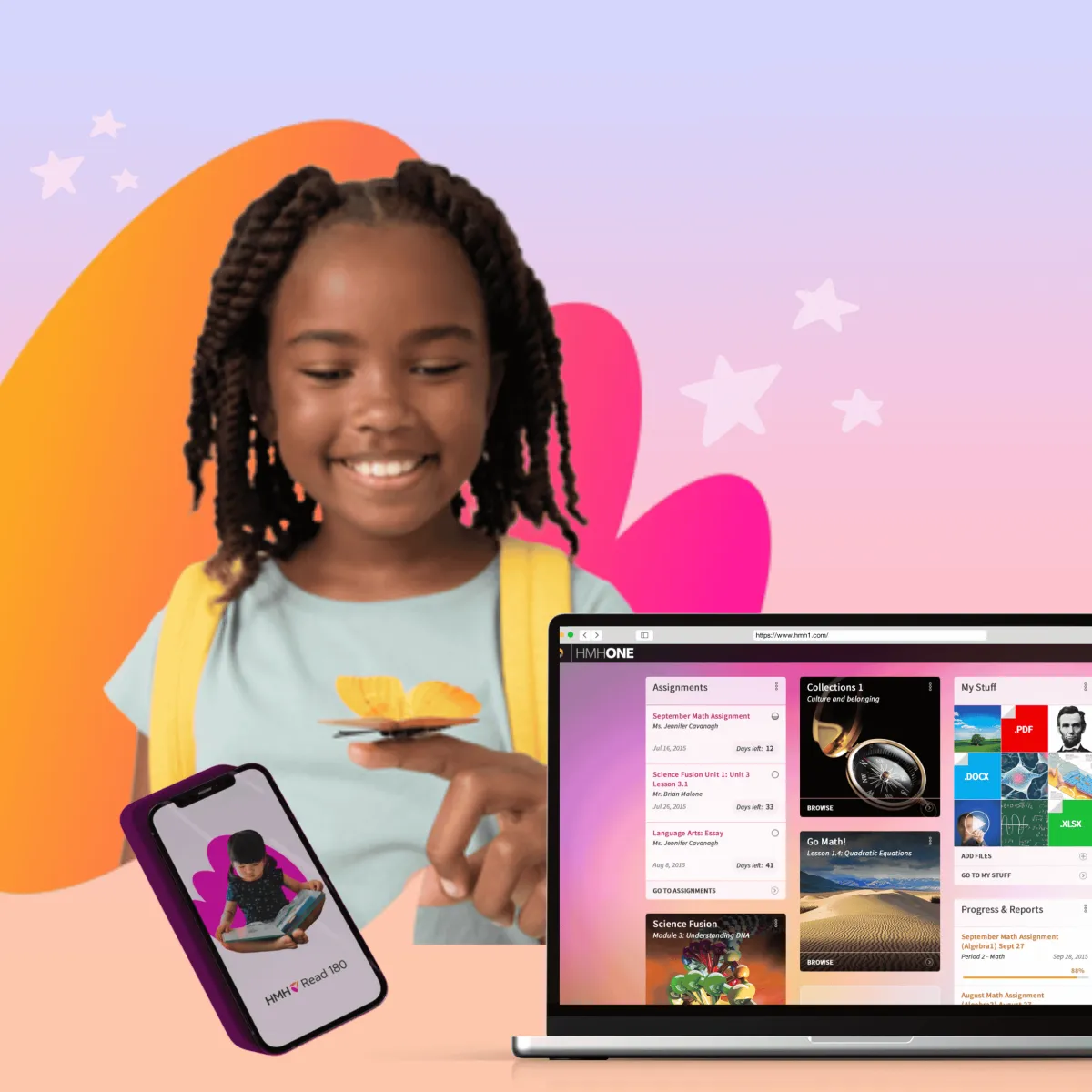
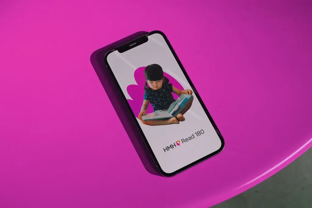
We designed the HMHONE experience to feel light, cheerful, human, professional, and friendly.
While we aimed to reflect the essence of HMH’s corporate branding, we intentionally introduced a more modern and playful aesthetic to better engage users—especially younger audiences, for whom we developed distinct UI variations.
White-label options for resellers were also considered from the outset, requiring flexible and customizable design components.
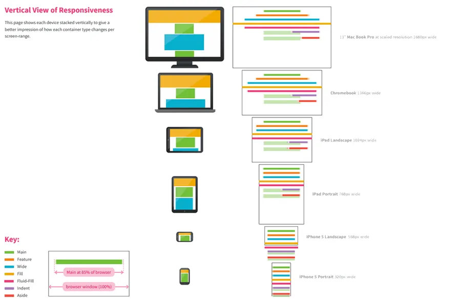
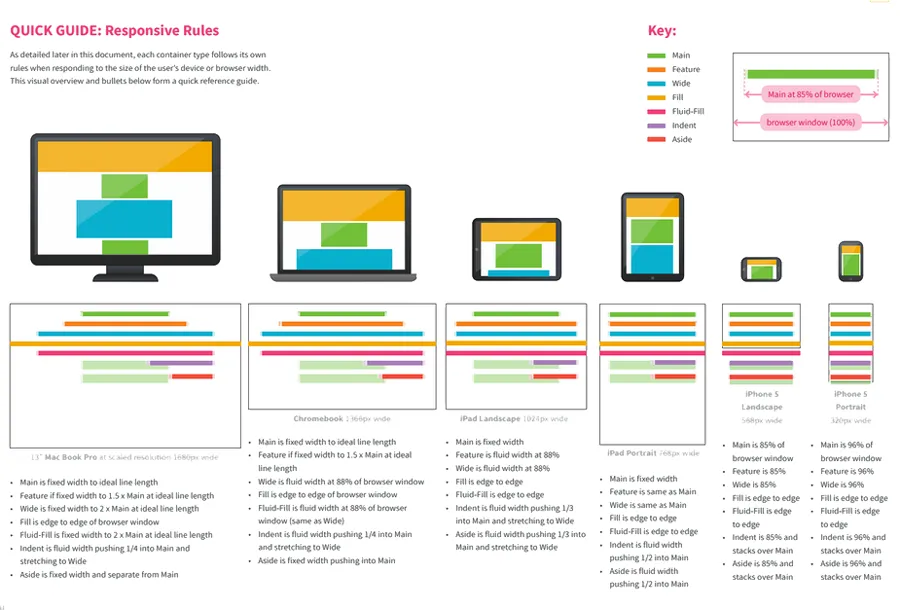
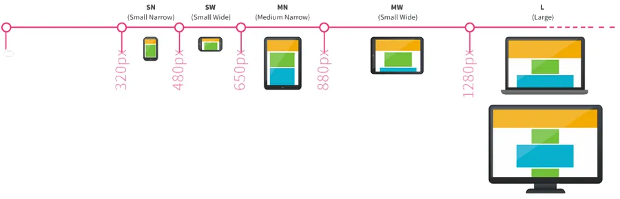
Our UI design system addressed all traditional interface states: Ideal, Error, Partial, Loading, and Blank. Each state was designed to be fully responsive, ensuring seamless functionality across desktop and mobile devices.
USER TESTING
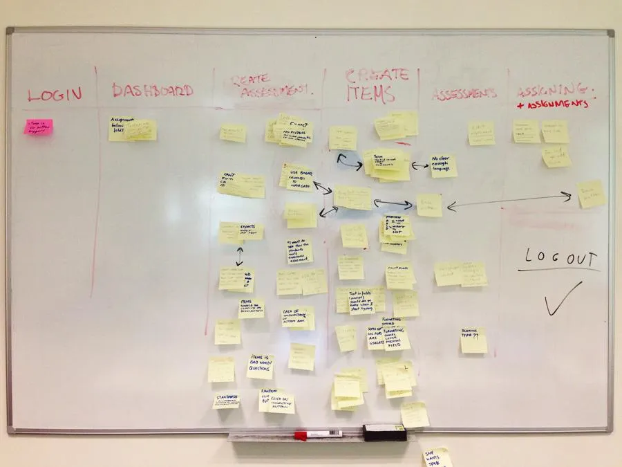
We conducted our first user testing in-house. We asked HMH staff who was not exposed to our application before to perform a few tasks in our application. The feedback was positive however a few unclear functional aspects have been discovered. We documented our findings and put a plan in place to rectify them one- by one.
Usability testing
For our next user testing we hired 4 teachers in various state in the US. They've been asked to complete a number of tasks they would normally do at work. Here is a list of some of them, create an assignment and assessment, generate a report, add and delete students to a class.
The sessions were followed by user interviews where our teachers/testers had a chance to highlight any possible issues they came across while completing their tasks.
The overall feedback was good. They liked the interface and the idea that all tasks can be done online and all information was saved into an archive relevant to each student, teacher and activity. A few minor challenges were discovered but overall, our application was ready for the Alpha release to our stakeholders.

IMPLEMENT
The Outcome & Impact


Our goal was to design the most visual, intuitive, and user-friendly school management platform in the EdTech space—one that would not only meet the functional demands of educators and administrators but also delight users across all age groups with its modern and engaging design.
Outcomes:
Enhanced Usability: The platform’s simplified interface and tailored user flows significantly improved ease of use across diverse user groups, including students, teachers, and administrative staff.
Strong User Adoption: Positive feedback from pilot schools confirmed high user satisfaction, with increased engagement from both students and educators within the first month of launch.
Visual Excellence: The proposed visuals were enthusiastically received by stakeholders, requiring minimal revisions and aligning perfectly with the project’s branding goals—modern, friendly, and human.
White-Label Flexibility: The design system supported white-labeling for resellers, offering flexible branding options without compromising usability or structure.
Cross-Device Consistency: Fully responsive designs ensured seamless user experiences across desktops, tablets, and mobile devices, accommodating varied classroom and remote learning environments.
WHAT THEY SAY
Recommendations
Thomas Haugh
Director of Operations in Design Architecture
HMH Studios: Design
Natalie O’Rourke has proved to be a highly trusted design partner in a cross functional team environment. She was engaged in the development and construction of a next generation platform experience which will serve U.S. teachers, students and parents – the numbers of which are in the millions. It’s a rich and complex project that requires a high level of strategic thinking along with excellent prototyping skills and a strong UX knowledge base. Natalie brought creativity and technical professionalism to the project every day, she was a pleasure to work with.
You may also like to browse: